Vehicle wraps are a great way to promote your business, getting your company 30,000-70,000 daily impressions for less than a dollar a day. With just one wrap you can create the appearance of a branded fleet, creating instant authority. To make the most out of your investment and reap all the benefits of a vehicle wrap, you’ll want to make sure to choose a design that’s going to get the attention of potential customers.
How to design a stand out vehicle wrap
1. Know your brand.
Your vehicle wrap should be a representation of your company and brand, reinforcing your brand image with every impression. Before you can start designing you need to know what exactly your brand stands for. Images, colors and even the font choice should convey your brand to your target audience.
Knowing your ideal client will also help you decide if your wrap should be fun or more professional, what type of pictures to use and what wording will best convince them to give you a call.
2. Go bold!
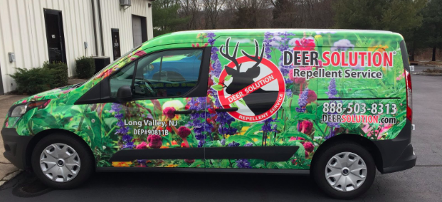
The whole purpose of using a vehicle wrap is to get people to see it. If you simply use a logo on a white background it may be easy for your wrap to go unnoticed, so take advantage of every piece of real estate with a full color wrap. You don’t have to move away from your branding to go bold either – simply using color effectively can make sure your wrap gets noticed wherever your vehicle goes.

3. Don’t include too much copy in your design.
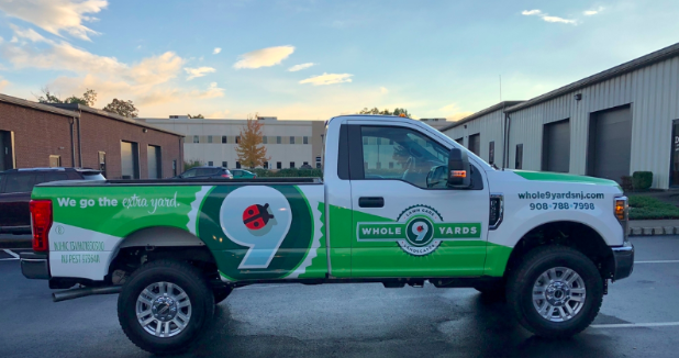
For the most part people are going to be seeing your vehicle wrap while on the road. Your wrap should be designed to make as much of an impact when someone sees it going 65 mph down the highway as it does at a red light. Adding in too many words will make it hard to take in your wrap quickly and could mean missed branding opportunities.
Make it easy for them to see exactly what you want them to see:
- Your logo and a strong brand identity
- Perhaps a tagline or a brief service line
- A phone number, social media account or web address
4. Consider how the vehicle will look from every angle.
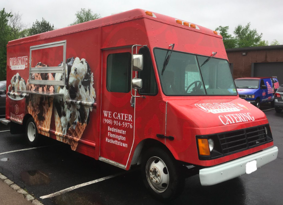
Your vehicle wrap is a moving billboard, so don’t assume it will be viewed head on or directly from the side. When deciding on how to lay out your design elements, consider what it will look like from every corner and view. You want the design to connect each side of the vehicle, so it looks like one large image that was painted rather than four separate pieces of artwork.
It’s also important to keep in mind how the wrap and lettering will look when the doors are open, especially if you’re going to be designing a vehicle with slide open doors. Smaller text should be avoided over any grooves or cracks, such as going from the driver door to the back door. Otherwise you could be left with a design that looks like it’s missing a letter.
5. Choose fonts that are easy to read.
Looking at a font on a computer screen is very different from seeing it on a vehicle wrap as you’re driving or from the passenger seat. As fun or exciting as some fonts might look on screen, they may not make for great choices on a vehicle wrap. Fonts with lots of embellishments or unclear lettering can be hard to read, so you’ll want to choose a typeface that is easy to read at a quick glance from a distance.
 Bring in those leads with vehicle wraps
A vehicle wrap builds instant credibility for your business, growing your brand awareness and getting the word out about your services or product to thousands of people a day. If you’re looking for a cost-effective way to advertise your business, it’s been proven that vehicle wraps have one of the lowest cost per impressions of any type of marketing out there. With some careful consideration during the design process you can easily create a vehicle wrap that will get the phone ringing!


 Bring in those leads with vehicle wraps

